

BY JULIE A. PALM
Discover what shades of dramatic purples, blues, blacks and reds are appropriate for your store’s identity and the message you want to convey to shoppers.
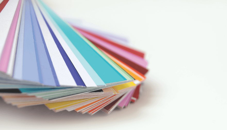
From the sign in your parking lot to the carpet in your store to the landing page of your website, you’ve had to make a lot of choices about the colors you use to represent your brand. Do they say what you want them to about your business? Are they fresh and up to date?
Whether you’re choosing colors for a new private-label mattress line or planning a store makeover, the shades you pick matter. And even if you’re happy with your store look and brand identity, incorporating contemporary hues into marketing or social media campaigns can keep you looking current in the eyes of consumers. Because you don’t want to just pick “blue” for your next project—you want a current, modern blue.
To get you started thinking in fresh ways about color, we’re going to introduce you to the most current shades of all: Colors of the Year for 2018.
Au courant colors
Every year, color forecasters unveil their picks and hot hues. Pantone, which sets color standards for a variety of industries, may be the best known for its Color of the Year, but it’s not alone. Other companies in the home furnishings industry, most notably paint manufacturers, have their own takes regarding what colors will inspire and delight consumers. To choose their favored colors for each year, color experts look to art and culture—from the entertainment industry to fashion runways—for cues and direction. They also peek in on social media, study new technologies and visit popular travel destinations. (Sounds fun, doesn’t it?)
Laurie Pressman, vice president of the Pantone Color Institute in Carlstadt, New Jersey, explains the value such forecasts provide: “The Pantone Color of the Year has come to mean so much more than ‘what’s trending’ in the world of design; it’s truly a reflection of what’s needed in our world today. As individuals around the world become more fascinated with color and realize its ability to convey deep messages and meanings, designers and brands should feel empowered to use color to inspire and influence.”
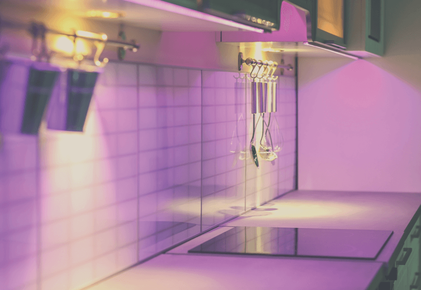
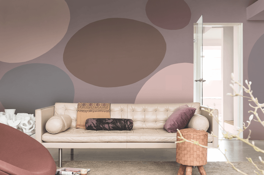
For 2018, many color forecasters coalesced around shades of purple, blue and black, saying they offer a sense of security and stability that people are craving. Blues and purples, in particular, represent the idea of sanctuary and are well-suited to restful spaces in the home, from meditation nooks to bedrooms. But don’t make the mistake of thinking these are dull hues. To the contrary, many of the color picks for 2018 are multidimensional and vibrant, even inspirational. A bit of an outlier, paint maker Benjamin Moore went all in on an invigorating red called Caliente.
Read on to learn more about Color of the Year choices from more than a half-dozen forecasters.
Purple reign
Ultra Violet: Pantone chose a radiant, bold purple it calls Ultra Violet as its Color of the Year for 2018, describing the hue as “dramatically provocative and thoughtful.” It is forward thinking, visionary and original, the company says.
“We are living in a time that requires inventiveness and imagination. It is this kind of creative inspiration that is indigenous to Pantone 18-3838 Ultra Violet, a blue-based purple that takes our awareness and potential to a higher level,” says Leatrice Eiseman, executive director of the Pantone Color Institute. “From exploring new technologies and the greater galaxy, to artistic expression and spiritual reflection, intuitive Ultra Violet lights the way to what is yet to come.”
Eiseman says purple has long symbolized creativity, unconventionality and artistic flair but also has a “mystical or spiritual quality” that makes it ideal for meditation rooms and other spaces designed to inspire connection and meaning.
When used in home interiors, Pantone says, “Ultra Violet can transform a room into one of extraordinary self-expression, or conversely, its polish can tone down a room with subdued, modern pairings.”
Perfect pairings for Ultra Violet: It works well with metallics, as well as greens and grays.
Amethyst: CIN, a maker of paints, varnishes and coatings based in Maia, Portugal, shares Pantone’s current passion for purple. But while Pantone’s Ultra Violet pick has futuristic, even technological, undertones, CIN’s Amethyst is inspired by the natural quartz stone. The company describes Amethyst as an “unexpected and almost magical hue” that radiates harmony and balance.
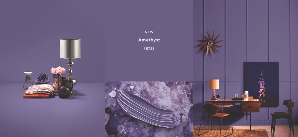
“This darker tone (Amethyst E723) fits in with the current trends in decoration, providing nuances that are different yet bold, but at the same time, classic and refined,” the company says. Amethyst is part of CIN’s Blue Revelations nature-inspired color palette that also includes the smoky gray Blue Mountains and the azure Into the Blue.
Perfect pairings for Amethyst: Blues, from pale and watery to inky and indigo. It also works, perhaps surprisingly, with warm browns.
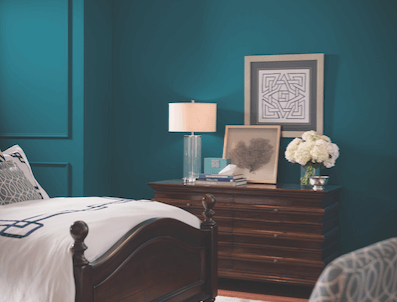
The blues
Oceanside: Following a trend seen in other colors like Pantone’s Ultra Violet, Sherwin-Williams’ Color of the Year, Oceanside, is a complex, multidimensional hue. The Cleveland-based paint company describes it as “a collision of rich blue with jewel-toned green, a color that is both accessible and elusive.”
“Green-blues in deep values, such as Oceanside (SW 6459), respond to changes in light, which is a quality that creates intense dimension,” says Sue Wadden, director of color marketing for Sherwin-Williams. “It is a tremendously versatile color and harmonizes with other diverse color groups.”
Perfect pairings for Oceanside: Eye-popping bright pinks and yellows. It also complements a range of blue shades and works amiably with corals and copper metallics.
In the Moment: Behr, a paint company headquartered in Santa Ana, California, is enamored with blue, too, but picked a softer shade it calls In the Moment for its 2018 Color of the Year.
Combining blue, gray and green, it’s “a soothing, restorative” hue that “evokes a sense of sanctuary and relaxation amid our busy, always-on lives,” according to the company. In home interiors, In the Moment fits with a desire to simplify living spaces for ease and contentment in a chaotic world.
Perfect pairings for In the Moment: Soft oranges and rusts are a nice complement to this shade. Bright whites create a spalike palette.
Not-so-basic black
Black Magic: Olympic, part of Pittsburgh-based paint and coatings maker PPG, is enthralled by Black Magic.
“In the current day, consumers often feel uneasy, restless or like their privacy is being invaded, so they crave deep, comforting colors that offer a welcomed escape from the chaos of daily life. Olympic paint’s Black Magic (OL116) perfectly satisfies consumers’ desire for privacy,” says Dee Schlotter, PPG senior color marketing manager for Olympic paint.
Perfect pairings for Black Magic: This deep shade teams well with popular grays and bright whites.
Deep Onyx: Going bold and dark, too, paint brand Glidden (also part of PPG) picked Deep Onyx, a “no-fuss shade of black,” as its hot color.
“Using a black paint color like Deep Onyx (00NN 07/000) on your walls or in your décor may feel intimidating at first, but it’s actually one of the easiest colors to use to create the low-key, easygoing style that’s trending for 2018. … Just like a little black dress, Deep Onyx is a classic, timeless staple,” says Misty Yeomans, PPG color marketing manager for Glidden paints.
Perfect pairings for Deep Onyx: It can be used with yellows and even browns for a natural look. Team it with white for a feel that’s fresh and crisp. With pink tones, Deep Onyx is a natural “pick me up.”
Getting warmer
While most Color of the Year picks are cooler shades of blue and purple or new takes on black, a couple of forecasters favor warmer hues of red and pink.
Caliente: Heading in a different and daring direction, Benjamin Moore picked Caliente as its go-to shade for 2018.
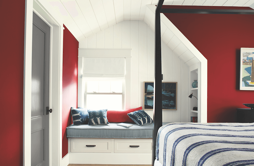
“Caliente AF-290 is total confidence. It is pleasing, passionate and makes people feel special, like ‘red carpet treatment’,” says Ellen O’Neill, director of strategic design intelligence for the Montvale, New Jersey-based paint company. “Whether used as one note or on four walls, the spirited personality of red turns heads, signaling surprise and adventure. The eye can’t help but follow its bold strokes.”
In the home interior, think of red’s versatility, O’Neill says. It’s a “bold, abstract stroke” in a midcentury modern home; a “farmhouse made crisp and current with red detailing” and “a beach house that brings in red for an unexpected neutral touch.”
Perfect pairings for Caliente: It’s crisp and classic with blue and white, and acts as a bright pop of color with muted grays.
Heart Wood: For its pick of the year, AkzoNobel selected an unusual shade of pink it calls Heart Wood, which the company describes as an earthy “gentle gray-pink tone” that represents the warmth of natural wood.
Explaining its choice, the Amsterdam-based manufacturer of paints and coatings, said that in a world where everything from the climate to politics seems unpredictable, people are seeking “a welcome home”—a sanctuary “where we can turn down the noise, where we can nurture our values and recharge.”
Perfect pairings for Heart Wood: Layer it with deep terra cottas or accent it with bold shades of blue and purple. It takes on a playful character when teamed with golds and yellow-toned greens.
These colors haven’t faded
There are some colors consumers might not be ready to embrace again—even decades after their heydays. The avocado greens and harvest golds of the 1970s come to mind, as do the mauves of the 1980s. But Color of the Year picks don’t rise to prominence one year and completely disappear the next. There are recent popular shades that you’re still seeing in consumer products, apparel and home interiors. They might have a place in your store’s coloring box, too.
Greenery—“a fresh and zesty yellow-green shade … nature’s neutral” (2017; Pantone 15-0343)
Rose QuartZ and Serenity—for the first time, in 2016, Pantone picked two colors, “a warmer embracing rose tone and the cooler tranquil blue, reflecting connection and wellness, as well as a soothing sense of order and peace” (2016; Pantone 15-3919 and 13-1520)
Marsala—“its grounding red-brown roots emanate a sophisticated, natural earthiness” (2015, Pantone 18-1438)
Radiant Orchid—“a captivating harmony of fuchsia, purple and pink undertones” (2014, Pantone 18-3224)
Emerald—“a lively, radiant, lush green” (2013; Pantone 17-5641)
More inspiration
Choosing colors, whether for your store interior or your delivery trucks, is a serious matter. As we noted in the story on page 25, consumers have strong opinions about and associations with certain colors. You don’t want to pick a hue that sends the wrong message about your business. That said, the actual process of exploring color palettes is creative and fun.
We’ve already given you lots of colors to ponder, but here are even more resources to use for guidance and inspiration.
- AkzoNobel’s Colour Futures: Four palettes for the interior, all centered on AkzoNobel’s 2018 Color of the Year, Heart Wood, plus three consumer personas tied to the palettes.
- Benjamin Moore’s Color Trends 2018: Images of home interiors featuring the paint company’s Color of the Year, Caliente, plus a 23-color palette of complementary hues for home décor.
- CIN’s Color Revelation: A look at CIN’s Color of the Year, Amethyst, plus four nature-inspired tonal palettes.
- HGTV’s Psychology of Color primer: An easy-to-use guide to the perceptions and association’s people have about various colors, along with tips for how particular hues can enliven the home interior.
- PantoneView Home + Interiors 2018: Eight palettes for home interiors for 2018. Includes 75 forecasted Pantone cotton standards for soft home applications. $495.
- Sherwin-Williams’ Color Mix Forecast 2018: Three color palettes—Sincerity, Unity and Connectivity—for these times.
Quick quiz can help you narrow color choices
Would you like more direction when choosing colors for your upcoming sales promotion or that new private-label, boxed-bed line for your store?
We aren’t saying this should take the place of a comprehensive color study by your marketing and branding team, but Grasshopper, a Boston-based provider of business services for small enterprises, has created a fun tool that could get you started in choosing hues for a new project. The seven-question color quiz takes only a minute to answer and might just point you to the perfect palette. Check it out at here.
The art of selecting the right color
Color is one of the first cues consumers use when making decisions about a product or brand, market research has shown. In the relatively short 90-second window people take to assess a product, color is one of the most determinative factors, accounting for as much as 90% of a consumer’s buying decision, according to Kissmetrics, a San Francisco-based customer research and marketing firm specializing in customer engagement and segmentation.
And 80% of consumers say color increases their recognition of brands, Kissmetrics reports. You can test this out in your own mind: The cheery red of Coke is instantly recognizable, as is the chocolate brown of delivery service UPS. Mobile phone companies also are among those taking the importance of color to heart, each claiming a strong hue or duo of colors to help set it apart in a crowded marketplace. For instance, T-Mobile is associated with hot pink; Sprint claimed sunny yellow; and Verizon is known by its black and red.
If you’re thinking about rebranding or giving your store a makeover, it helps to know what messages specific colors convey to consumers. Here are some guidelines from Kissmetrics and Insights in Marketing, a marketing research firm headquartered in Northbrook, Illinois.
- Red: Denotes energy and urgency; it’s often used to signal sales or limited-time-only offers
- Orange: Appeals to impulse shoppers; creates an urgency for people to buy; linked to athleticism and energy
- Yellow: Associated with happiness, enthusiasm and joy; frequently used to grab attention or draw customers into a store
- Green: Creates a sense of relaxation; associated with nature, good health and environmental stewardship
- Blue: Instills a sense of security and trust; can induce calm; linked to nature and, of course, bedding and sleep
- Pink: Romantic and feminine; often used for products aimed at women and girls
- Purple: Can be soothing and calming; frequently used in beauty products
- Black: Associated with power and wealth; denotes luxury products
- White: Seen as clean and pristine; conveys innocence and purity.
Given their emotional pull, colors can attract certain types of buyers, according to Kissmetrics. Impulse shoppers are drawn to red, orange, yellow and even black, while budget-conscious consumers feel more comfortable with navy blue and teal. Pinks and paler blues can prompt traditional shoppers, who want to make well-reasoned decisions, to open their wallets.
And when used in combination, colors can take on different meanings. As a trio, blue, white and green are associated with trust. Similarly, the combo of black, blue and green denotes security. It makes sense then that those color combinations often are used on law enforcement vehicles. In contrast, when yellow, brown and orange combine, the message can be “cheap” and a trio of yellow, white and red conveys speed—which is probably why virtually every fast-food chain favors those colors.
In the eye of the beholder
While consumers have strong associations with colors, it’s important to note that when we talk about color, we’re speaking in broad generalizations. People’s perceptions of color are highly subjective. They vary from person to person, but also region to region and culture to culture. Moreover, consumers’ perceptions are influenced by factors like light levels and one color’s proximity to other colors. Remember that social media meme from a few years back that had people questioning whether a certain striped dress was black and blue or gold and white? (Apparently, the manufacturer confirmed the dress was black and blue, but millions of people swore it was gold and white.)
“Color is personal. It evokes different emotions in different people,” Judith van Vliet, vice president of communications and public relations at the Alexandria, Virginia-based Color Marketing Group tells the American Marketing Association in a recent article.
And while certain colors can evoke specific emotions and even prompt action, the most critical decision for a retailer is choosing colors for your store that are appropriate to your brand identity and the message you want to convey to shoppers.
In other words, the colors you select should “support the personality you want to portray instead of trying to align with stereotypical color associations,” says Gregory Ciotti, a Philadelphia-based content marketing strategist who writes about color and branding for Entrepreneur and other publications.
“The relationship between brands and color hinges on the perceived appropriateness of the color being used for the particular brand (in other words, does the color ‘fit’ what is being sold),” Ciotti writes. So, he adds, “if Harley owners buy the product in order to feel rugged, you could assume that the pink plus glitter edition wouldn’t sell all that well.”
And if you’re considering a major rebranding or launching a new endeavor, pay attention to what colors your competitors already have staked out. Research has shown, Ciotti writes, “that our brains prefer recognizable brands, which makes color incredibly important when creating a brand identity. It has even been suggested … that it is of paramount importance for new brands to specifically target logo colors that ensure differentiation from entrenched competitors (if the competition all uses blue, you’ll stand out by using purple).”
 Julie A. Palm is chief wordsmith at Palm Ink LLC in Winston-Salem, North Carolina. She has 25 years of experience as a writer and editor for newspapers and magazines and as a publications director. She is a past editor in chief of both Sleep Savvy and BedTimes magazines. She can be reached at japalm623@gmail.com.