
Whether you’re updating your store’s interiors, considering a rebranding, or partnering with a mattress manufacturer to develop a private-label bedding line, you’ll need to pick colors. And that’s a fun part, right?
To help you stay up to date, we’ve rounded up several color of the year picks from color forecasters and paint companies to give you an idea of the hot hues and color trends you may want to keep in mind.
Overall, we don’t see many of the tech-inspired brights that were more prevalent a few years ago. Instead, the 2026 palette is reassuring, earthy, and classic. Color forecasters say their picks are a response to consumers’ need for comfort and grounding. It makes sense: Many people feel untethered, uncertain, and even fearful right now as they deal with everything from a shaky economy to rapid technological changes, divisive media, and catastrophic weather. We want to feel soothed and grounded, and color can help us do that.
Here’s a look at some of the color of the year picks in more detail, moving from light to dark.
Soft and bubbly
C2 Paint looked to the Champagne region of France for inspiration for its color of the year, Epernay (639). The company, based in Amherst, New York, describes Epernay as a “refined, earthy soft ochre with hushed mineral undertones” that was inspired by the rolling vineyards and sunlit limestone architecture of the French village with the same name.
“For 2026, we find ourselves reflecting back to honor the legacies that shape how we live today,” the company says about its color choice. “From the intricate details of architectural ornamentation to the enduring allure of natural materials, we’re inspired by a time when artistry, detail, and ritual were woven into everyday life. This year marks a return to design that nourishes the soul—rich with depth, purpose, and beauty.”
Epernay is part of C2’s En Terre palette for 2026, which calls to mind natural fibers, weathered facades, and well-loved gardens. Other colors in the palette include Parador, a greenish gray reminiscent of earthenware; Spearmint, a soft blue-green with gray undertones; Potato Leek, a yummy, gray-toned white; Snow Sky, a brilliant blue-white; and Blueberry, a deep blue with hints of teal.
These would be warm shades for store interiors. They could also work as an inviting ground for mattress panels, if you’re working on a private-label mattress line.
Putting it in neutral
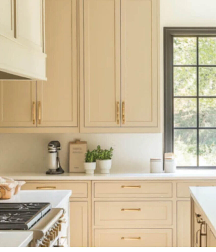
Like C2, Dutch Boy Paints picked a solid neutral for 2026, as the company’s trend watchers sensed a “cultural shift toward simplicity, authenticity, and intentional living.” Melodious Ivory (313-2DB) is a warm, soft, creamy beige.
“Our 2026 color of the year invites homeowners to embrace what matters most: comfort, quality, and connection,” says Lisbeth Parada, color marketing manager for Dutch Boy, based in Cleveland. “Melodious Ivory offers a classic backdrop that beautifully supports the textures, elements, and personal touches that make a space truly feel like home.”
Dutch Boy has incorporated Melodious Ivory into three palettes for 2026. First is Heartland, “which pays tribute to traditional craftsmanship,” according to the company. Think handmade furniture, classic décor, and gatherings of friends and family. The second palette is Rekindle, with a focus on “wellness, sustainable living, and connection to nature,” the company says. The third palette is Serendipity, a playful, retro-inspired collection of colors Dutch Boy says is designed “to bring personality and playfulness to modern minimalist spaces.”
Like C2’s Epernay, Melodious Ivory would be a soothing color for mattress panels in a private-label line and is well-suited for store walls.
Long live khaki
Cleveland-based paint company Sherwin-Williams says it chose Universal Khaki (SW 6150), “an essential neutral,” as its color of the year for 2026 because of its “beautiful balance of livability and longevity.” The midtone neutral has a light yellow undertone, in keeping with a general warming of interior color palettes from the cool grays and bright whites that had been dominant for several years.
Universal Khaki is a color that evokes functionality, familiarity, and timeless appeal.
“There’s something enduring about khaki; it bridges the past and the future in a way that feels both familiar and forward-thinking,” says Sue Wadden, director of color marketing for Sherwin-Williams. Wadden notes that khaki has often been a pick for outdoor clothing, uniforms, and casual wear.
Universal Khaki pairs well with other earthy tones, as well as warm woods and soft whites. Sherwin-Williams has included the color in a broader palette for 2026, along with Garden Gate, an earthy green; Watery, a soft blue-green; Tarragon, a moody blue-gray; Henna Shade, a warm terra-cotta; Lemon Chiffon, a sunlit yellow; Cream and Sugar, a creamy neutral; White Snow, a crisp white; and Special Walnut, which happens to be stain brand Minwax’s color of the year.
Consider teaming Universal Khaki with those blues and greens into a panel fabric for a private-label line. The color would also work nicely as a border or tape edge.
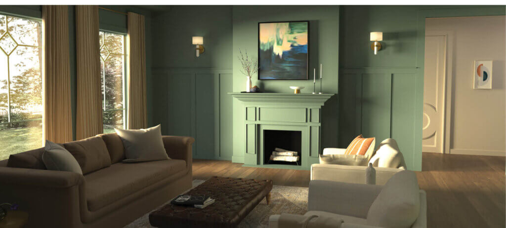
A breath of fresh air
Cleveland-based Valspar chose a pale green gray as its color of the year. The paint company describes Warm Eucalyptus (8004-28F) as “naturally restorative and serene,” reflecting “a collective desire for calm.”
“Warm Eucalyptus is more than just a beautiful shade of green; it’s a reflection of the comfort we crave in our homes,” says Sue Kim, director of color marketing at Valspar. “Its warm undertones create a grounded, welcoming mood while drawing inspiration from nature and the familiarity of retro design. This is a color that encourages restoration and resilience.”
Valspar offers a cast of what it calls “supporting colors” for Warm Eucalyptus, including Degas Blue, a breezy light blue, and Groundbreaking, a cozy deep brown with gray notes.
Warm Eucalyptus has a vintage feel but doesn’t appear dated. If you’re aiming for a spa-like feel in your store interiors—or in your marketing materials—this color would be a great pick. Perfect for creating a space for rest and renewal, Sleep Savvy expects consumers will love Warm Eucalyptus for their own bedrooms, too.
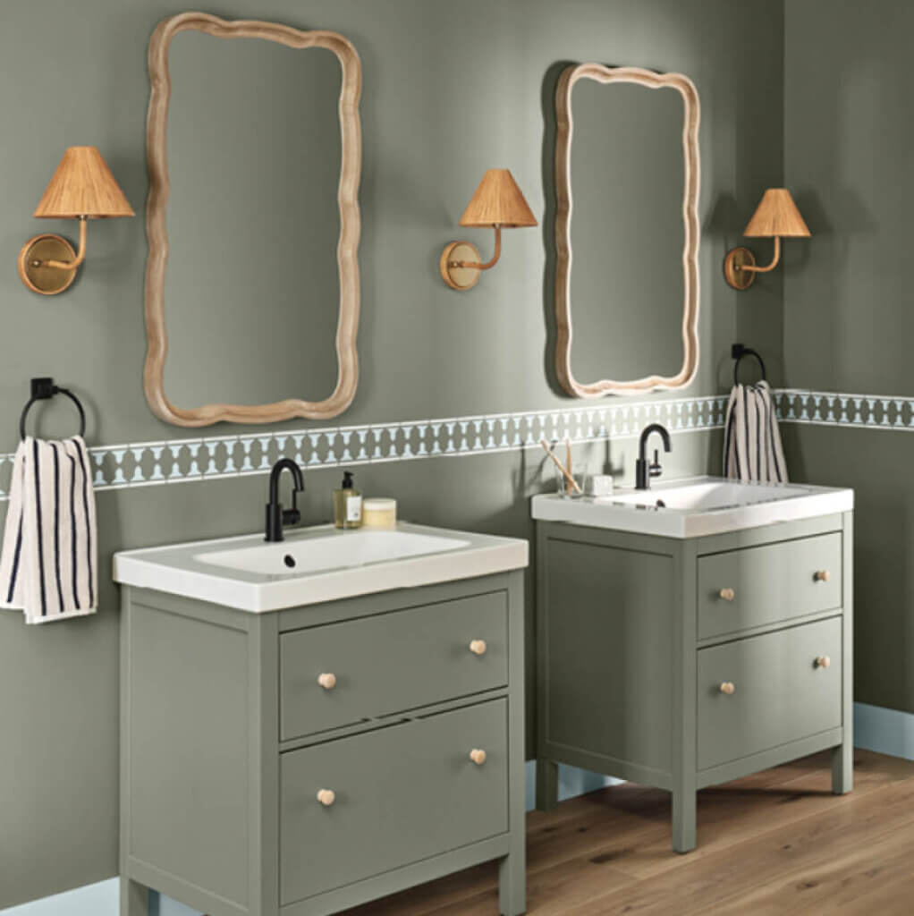
Going deeper
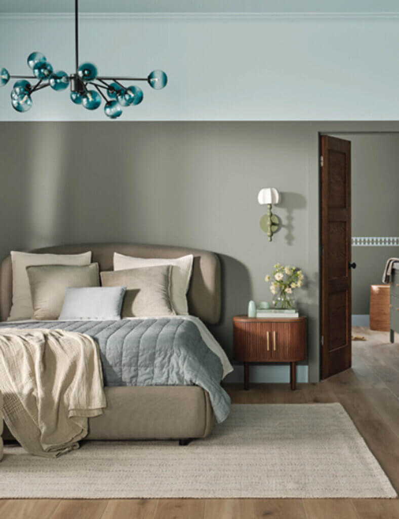
Behr Paint Co. went with a darker green for 2026. It describes Hidden Gem as “a smoky jade with an air of mystery and sophistication.”
The midtone blue-green color is both grounding and energizing.
“Now, more than ever, there’s a growing appetite for colors that challenge convention and bring an unexpected sense of wonder to everyday spaces,” says Erika Woelfel, vice president of color and creative services at Behr, which has headquarters in Santa Ana, California. “Hidden Gem captures that spirit in both name and color. Its depth and refinement meet the desire for colors that are eternally stunning and stylish.”
Hidden Gem pairs well with light browns such as Wheat Bread and Dainty Lace from Behr’s extended 2026 color palette, as well as blues such as Dragonfly and Watery. A midtone gold called Beehive would add brightness when paired with Hidden Gem.
Greens haven’t been widely used in mattress fabrics and coordinating materials in the United States in recent years. Touches of a restful green like Hidden Gem might help a new private-label line stand out on its website and showroom floor. Consider it, too, for rebranding efforts.
An inviting red
Glidden, part of Pittsburgh-based PPG, chose the grounding, wood-rooted color Warm Mahogany as its
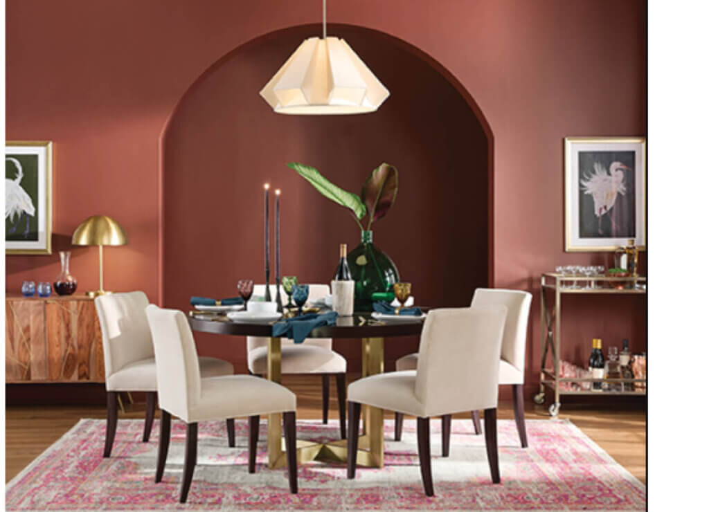
pick for 2026. As the company says, “it’s bold enough to draw immediate attention and reserved enough to make a timeless statement.”
Warm Mahogany is a move toward colors tied to what matters: “rest, connection, and creativity,”
Glidden says.
Other reddish browns from the PPG 2026 color palette include Spiced Cider and Red Clay. Oakwood Brown is a midtone with red undertones. Copper Beech skews a little more orange.
Think of Warm Mahogany as a stylish alternative to black or deep gray. The color is neutral enough to anchor store walls, where it would provide a strong, contrasting background for mattress displays. If you’re not feeling that bold, try it as an accent on displays or on the sales desk.
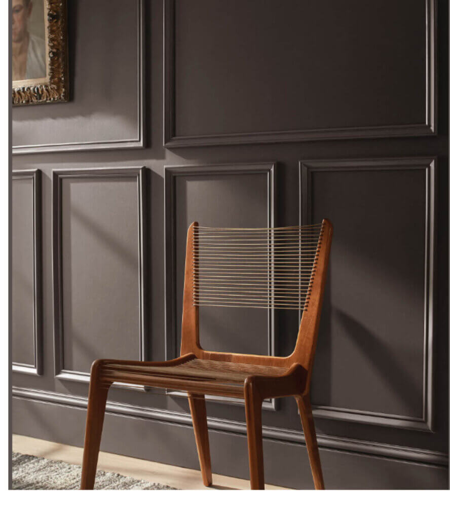
Rich and refined
Silhouette (AF-655) is Benjamin Moore’s hot hue for 2026. The rich espresso has notes of charcoal to add even more depth. It’s a refined, graceful, and stylish color that the Montvale, New Jersey-based paint company says was “inspired by the modern take on classical suiting.”
“The connection between fashion and interiors has always been a source of inspiration, but this year in particular, we’ve noticed a renewed interest in suiting and classic silhouettes, the resurgence of timeless pieces, and the growing interest in the brown color family,” says Andrea Magno, director of color marketing and design for Benjamin Moore. “Silhouette embodies these qualities with its depth and luxurious blend of burnt umber and delicate charcoal undertones. Like a perfectly tailored suit, this hue has the versatility and softness to bring a space from expected to exceptional.”
Silhouette pairs well with cream and latte shades. Benjamin Moore has also included Silhouette in a broader palette of coordinating and contrasting colors for 2026 that includes Narragansett Green, an inky black pine; Southwest Pottery, a rich terra-cotta; and Sherwood Tan, a sandy midtone. Four lighter shades in the palette are the gray-green Radiance, the blushing beige First Crush, the creamy Swiss Coffee, and the pale lavender Batik.
Consider using Silhouette for a rich tape edge or luxurious border on a high-end private-label mattress line or as an elegant accent color in store interiors.
The colors of the year and their accompanying palettes should provide plenty of inspiration as you tackle the projects this year that will help you entice consumers and boost sales.
Beyond the Paint Chip
Paint companies have made it easier than ever to get a sense of their colors. There is the traditional paint chip strip, but many companies now also offer free paint samples, as well as peel-and-stick adhesive sheets for a no-mess way to see how a hue will look on a wall.
In addition, online 3D visualization tools and apps allow you to “paint” your store’s showroom to see how a color will look in your space and even how the color will look under different light conditions. Some companies allow you to download their colors into Adobe and AutoCAD color palettes, too.
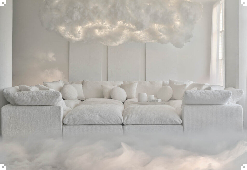
Pantone looks to the skies for Cloud Dancer
Airiness. Open space. Freshness. A blank canvas. Pantone’s pick for color of the year—a delicate white called Cloud Dancer—evokes all those ideas.
“Cloud Dancer signifies our desire for a fresh start. Peeling away layers of outmoded thinking, we open the door to new approaches. An airy white hue, Pantone 11-4201 Cloud Dancer opens up space for creativity, allowing our imagination to drift so that new insights and bold ideas can emerge and take shape,” says Laurie Pressman, vice president of the Pantone Color Institute, based in Carlstadt, New Jersey. Pantone, a color communication and management company, provides a widely used color reproduction system and typically caps the parade of color of the year picks from other companies with its announcement in December.
As the ultimate neutral, Cloud Dancer promises clarity and simplicity. “The cacophony that surrounds us has become overwhelming, making it harder to hear the voices of our inner selves. A conscious statement of simplification, Cloud Dancer enhances our focus, providing release from the distraction of external influences,” added Leatrice Eiseman, executive director of the Pantone Color Institute.
Pantone has released two coordinating palettes: Powdered Pastels, a series of nuanced, understated pastels and neutrals; and Light & Shadow: a collection of soft, shadowy shades.
In an industry known for its “white rectangles,” it’s easy to imagine how Cloud Dancer could make its way into mattress fabrics, providing a visual cleanliness and nod to well-being.
Julie A. Palm is lead wordsmith at Palm Ink LLC and is a past editor-in-chief of BedTimes and Sleep Savvy magazines. You can contact her at japalm623@gmail.com.