Last year’s bright colors have been replaced by subdued hues and timeless neutrals, ideal for creating sleep sanctuaries.
If anything can be relied on in today’s seemingly unpredictable world, it’s that trends will come and go as consumer preferences evolve. But what may seem like simple affinities for a certain color, fabric or aesthetic are part of trend cycles that reflect the broader cultural mood.
“Everything we do at FS is tied into larger cultural movements, consumer sentiments and behavior,” says Hallie Spradlin, director of visionary at FS, a New York-based
consumer insight and trend forecasting company.
Whereas in 2024, colors of the year were, for the most part, light and bright — think Pantone’s Peach Fuzz 13-1023 or Valspar’s Renew Blue 8003-37D — in 2025,
leading paint and color systems companies anticipate subdued colors will become prevalent.
According to relationships expert Jonathan Hartley, who has a master’s degree in psychology, there’s a good reason for that. “The current attraction to muted colors — in bedding especially — reflects all of our collective need for emotional decompression of sorts. After years of societal division and constant digital stimulation, we’re really now seeking actual sanctuary in softer, less demanding tones.”
Joana Walker, a Milan-based fashion expert and writer for fashion brand Margo Paige, agrees. “The saturated colors of 2024 represented the desire for optimism, energy and a sense of renewal after the dark times of the pandemic,” she says. “Bright hues symbolized hope and a craving for emotional rebirth. In contrast, 2025 colors are more subdued, as now we find ourselves needing tranquility, grounding, psychological comfort and mental clarity.”
Read on to see all of the color of the year selections. When planning your merchandising mix, knowing what colors are trending could help you choose items that will resonate with shoppers. Or keep a certain color in mind if you have any store renovations in the works.
Creating Calming Sleep Sanctuaries with Subdued Hues
“Colors of the year have probably never done as much for the bedding industry as in 2025,” Walker says. “Serene, restful spaces for sleep can only benefit from warm taupes and muted blues, especially when compared with energizing, bold yellows taking the stage in the previous seasons. Moreover, these trending natural colors match cotton and linen instinctively. With the right texture added to the mix, the pair creates an impeccable sleep sanctuary.”
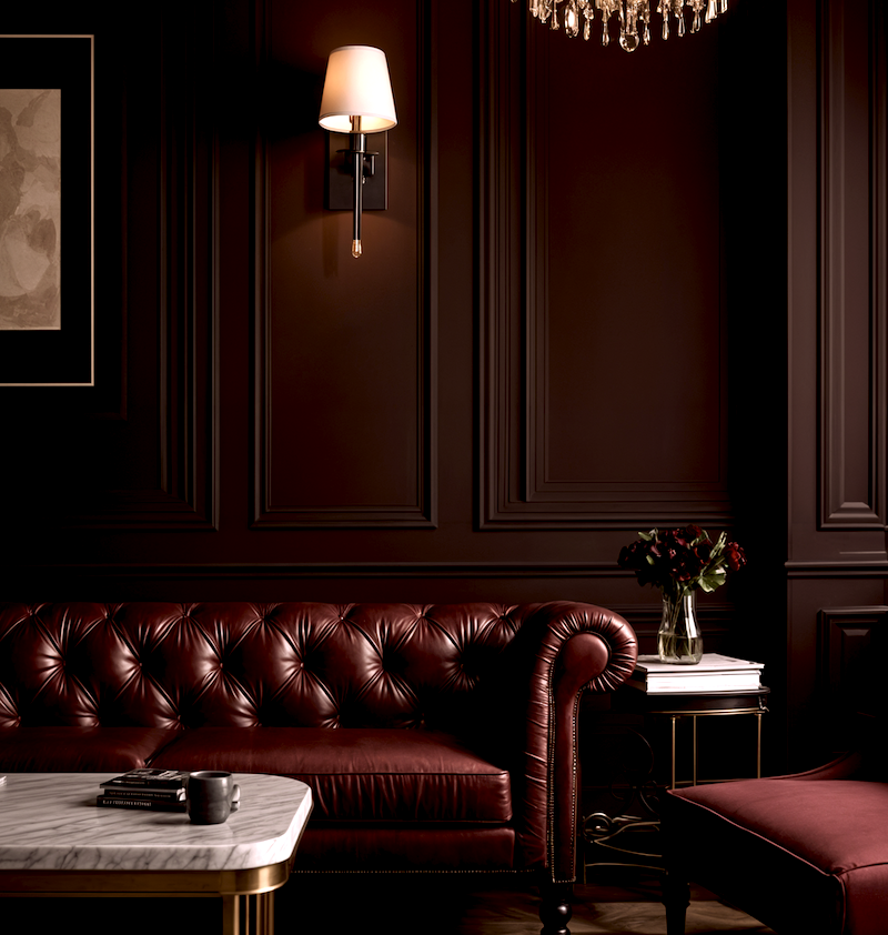
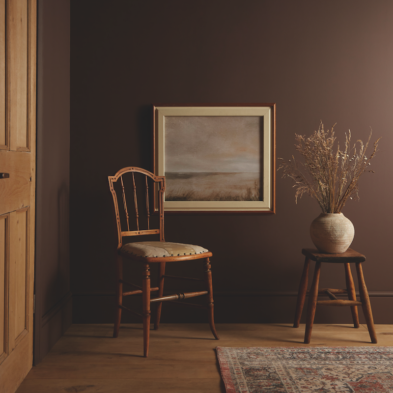
Featuring earth-inspired colors, most of this year’s picks signal a desire to connect with nature. FS states that this natural palette is part of a color shift (the first signal that indicates the trajectory of various color groupings) the company calls Buried Neutrals.
“These are hardworking neutrals, imbued with a sense of timeless significance,” Spradlin says. One example is Graham & Brown’s 2025 color of the year, Elderton. The deep color takes cues from the elder tree, which has rich, brown leaves. “Elderton has a huge amount of depth, reconnecting us with nature and enhancing our relation to the earth,” says Paul Taylor, head stylist and trend specialist for the Blackburn, England-based home decor company.
Lowe’s, the Mooresville, North Carolina-based home improvement retailer, also echoes the culture’s current propensity toward nature in name and hue. After analyzing trends from recent trade shows and showrooms, the company announced that its Stainmaster brand chose Truffle, a deep brown hue as its color of the year.
Lauren Hoferkamp, who is the lead color expert at Dunn-Edwards, headquartered in Los Angeles, agrees with relationship expert Hartley. “In the current fast-paced, high-tech age, we find ourselves drawn to more saturated and timeless colors to create personal spaces that feel welcoming, stylish and grounded. When considering the draw to a mindset of ‘old is new,’ Caramelized DET687 emerged from our 2025 Color and Design Trends as a clear representation of this new year. The effortlessly versatile hue pairs well with various styles from vintage-inspired interiors to contemporary spaces.”
Continuing the theme of respite, Manchester, England-based paint and wallpaper manufacturer Little Greene selected Mochi (344), a light brown with peach-pink undertones as a modern neutral. “Rich warm colors deliver cocooning, restful and charming spaces and are perfect for creating enticing and sumptuous spaces within our homes,” says Ruth Mottershead, creative director at Little Greene.
Purple Power: Adding Depth and Drama with Purple Accents
Softly Bruised, another color shift by FS, captures a spectrum of colors found in the healing process of a bruise. “This shift mirrors our own journey of recovery, mirroring the raw intensity of pain while celebrating the gradual, hopeful transition toward healing,” Spradlin says. According to FS, cultural trends driving this color shift forecast are social turmoil that is causing people to explore uncomfortable realities, in addition to the ongoing loneliness crisis. People looking for connection are seeking refuge in all types of relationships, from platonic to romantic, and are even leaning into the idea of “found family” for comfort.
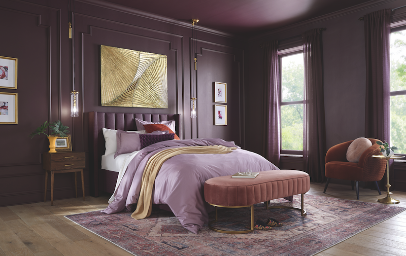
“For 2025, purple isn’t just permitted, it is encouraged,” says Ashley McCollum, marketing manager of color at Glidden. With purple reigning supreme in 2025 and beyond, adjacent hues like Wilted Petal, Subtle Umber, Black Jam and Soaked Violet will also be popular, FS says.
Glidden’s 2025 color of the year pick, Purple Basil PPG1046-7, is a perfect example. A news release from the Pittsburgh-based company states that “Purple Basil represents the appreciation for self-discovery and self-expression that has led to the rise of maximalism across industries, including design, fashion and consumer goods.” This dovetails with a recent article from Architectural Digest heralding the return of maximalism after years of stripped-down silhouettes, light colors and minimal patterns in interior design.
As a mixture of plum and brown, Benjamin Moore’s Cinnamon Slate 2113-40 bridges the gap between the Softly Bruised and Buried Neutrals color shifts. “As the use of more saturated color in design has increased in recent years, we are seeing a growing interest in more nuanced colors, whose undertones add intricacy and dimension,” says Andrea Magno, director of color marketing and design at Montvale, New Jersey-based Benjamin Moore. “Cinnamon Slate is an inviting hue that offers enduring style and modern sensibility.”
Incorporating Red Accents: Adding a Touch of Luxury to Your Bedroom
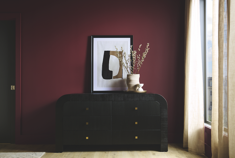
Reds will also be in demand in 2025. In new research from Santa Ana, California-based paint company Behr, 84% of respondents stated that “a small pop of red in a room catches their attention.” Additionally, 70% surveyed said a pop of red made a space “feel more elegant and cohesive,” and 75% said they would consider painting a room or wall a shade of red. With bedrooms at the top of many renovation wish lists, Behr’s 2025 color of the year, Rumors MQ1-15, is a good consideration for those looking for warm ruby red.
They might also consider C2 Paint’s selection Raku C2-529, with undertones of mahogany and deep purple. The Amherst, New York-based company named it after a type of Japanese pottery typically used in tea ceremonies; it reflects the culture’s current pursuit of meditative experiences.
“Raku is an expression of balance, comfort and timeless elegance,” says Philippa Radon, C2 Paint color director. “In a world where polarizing views can divide and isolate, Raku offers a palette that returns us to simple, grounding pleasures.”
Creating a Serene Oasis with Soothing Blues
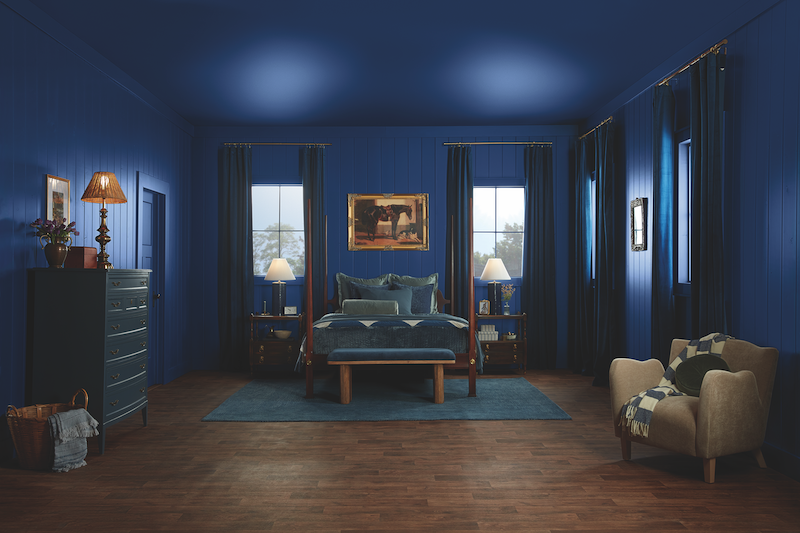
Last year’s picks were dominated by bright blues. Although the color is still present in the 2025 selections, it — similar to the reds and purples — is more saturated.
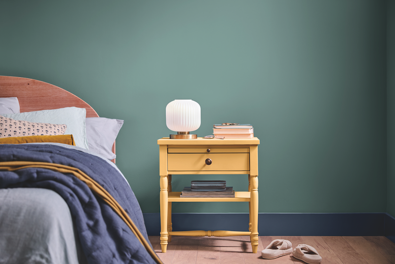
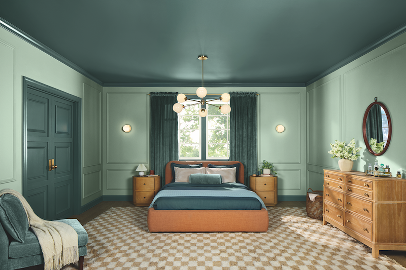
On the gray-leaning side, Quietude by HGTV by Sherwin-Williams nods to 2025’s theme of consumers seeking tranquility. A news release from the Cleveland-based company states that the soft green has influences of blue that serve as a reminder “to slow down and look for happiness in the everyday small moments that connect us all.”
Similarly, Dutch Boy Paints’ Mapped Blue 429-5DB features a medium-tone blue with slight yellow undertones. “Our 2025 color of the year, Mapped Blue, is more than just a trend: it’s a reflection of changing consumer values,” says Lisbeth Parada, color marketing manager for Cleveland-based Dutch Boy Paints. “We’re seeing a significant shift, particularly among millennials and Gen Z, toward products that offer durability, functionality and timeless aesthetics. Mapped Blue answers this call, providing a classic yet modern charm that can adapt to various design styles and stand the test of time.”
Small luxuries
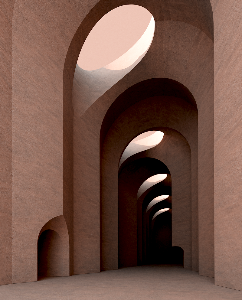
Briny Hues, the third color shift presented by FS in its trends webinar, perhaps best captures the mood of today’s consumers. (Think caramelized colors and shades like fig and olive brine.) “Briny Hues evokes a sense of sacred savoring, encouraging us to relish fleeting moments whether indulging in a caramelized dessert, feeling the plush softness of a velvet sofa or savoring the first sip of our favorite beverage,” Spradlin says.
This is embodied in Pantone’s pick, 17-1230 Mocha Mousse. The Carlstadt, New Jersey-based company says that the color, which it classifies as a warming, rich brown hue, “nurtures with its suggestion of the delectable quality of cacao, chocolate and coffee, appealing to our desire for comfort.”
With instant gratification now the norm, the idea of moving slowly is the ultimate luxury. These rich colors are a sign that people are looking to luxuriate however they can, something that is a positive sign for the bedding industry. Because bedrooms can be one of the best places in the home to recharge, it could indicate that consumers will turn their attention to making their bedrooms into a true refuge.
So when speaking with your customers this year, assist them in finding ways to transform their bedrooms into the ultimate sleep sanctuaries, with the right mattress and sleep accessories.
Read more Sleep Savvy features.


