
The 2024 colors of the year bring a sense of calm.
Think of your favorite color. Whatever comes to mind is one of the nearly 10 million colors that a human eye can distinguish, according to the American Academy of Ophthalmology. And every single color has the power to evoke different emotions or influence the atmosphere in which it appears.
“Colors seen have a significant effect on how humans think and behave, how they experience their physical world and whether they achieve the goals they’ve set for themselves,” says Sally Augustin, principal of La Grange, Illinois-based firm Design With Science. “Happily, for most of us, we do perceive color, and color can have a big effect on our mood, how our brain functions, how well we get along with other people, all sorts of different things.”
Perhaps the most memorable color of the year in 2023 (of those chosen by forecasting and paint companies) was Pantone’s Viva Magenta 18-1750, a shocking pink. In 2024, calming shades will reign supreme with selections ranging from vibrant blues to honey beige and rich greens to soft black. No matter the hue, themes of nature, wellness or cocoon-like comfort unite them all — heralding that this year, it’s time to take a step back and relax. Keep reading to dive into the 2024 colors of the year and learn how to apply them in retail settings.
Shades of blue
One might say this year’s class of colors is tailor-made for the bedding industry. The most predominant color among the 2024 lineup is blue, with paint and stain companies Benjamin Moore, C2 Paint, Dunn-Edwards, Sherwin-Williams and Valspar all selecting a shade in the hue, historically associated with sleep and sleep products thanks to its calming aura.
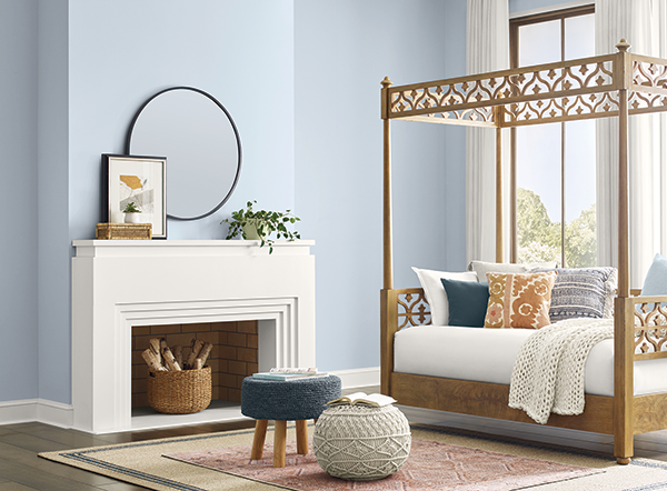
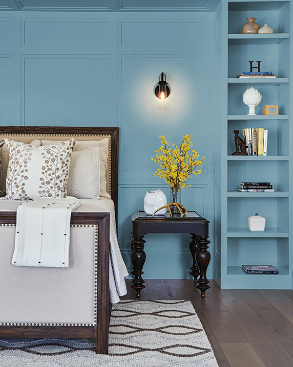
“We liken blues to trustworthiness, competence, that kind of thing,” Augustin says. “When people are having to make a considered purchase, it’s better if they’re in a space that isn’t too energizing, that doesn’t rev them up. Because if they have to think through pluses and minuses and they’re in a space that’s really energizing, often they just leave, or they don’t buy anything at all,” she says. One way to keep potential customers in the store longer is to use a palette of what Augustin refers to as “relaxing colors,” like light blue or pale pink. Calming colors can encourage shoppers to thoughtfully compare mattresses as they feel at ease rather than invigorated.
Upward SW 6239, Sherwin-Williams’ 2024 color of the year, represents “the gentle forward momentum in all of our lives,” says Sue Wadden, director of color marketing for Cleveland-based Sherwin-Williams. “It brings to life that carefree, sunny day energy that elicits a notion of contentment and peace. With this color, we invite our consumers to take a pause and infuse a new sense of ease and possibility into their spaces — one that doesn’t overwhelm, but rather establishes meditation and tranquility,” she adds.
Minneapolis-based Valspar named the grayish sea-green Renew Blue 8003-37D its color of the year, as it “evokes a feeling of balance and calm,” says Sue Kim, director of color marketing for Valspar. Somewhere between Valspar’s Renew Blue and Sherwin-Williams’ Upward is Thermal 752 from Buffalo, New York-based C2 Paint. Embodying what Augustin describes as a calming color, “C2 Thermal reminds us of a vast blue sky and the infinite array of blue hues nature offers to help restore and redefine our mood. This bespoke pale yet punchy blue is poised for adventure and brimming with hope, evoking feelings of loyalty, trust and confidence,” says Philippa Radon, interior designer and color specialist for C2 Paint.
Dunn-Edwards, headquartered in Los Angeles, also references nature with its 2024 pick, Skipping Stones DET567. The gray-blue color is part of the paint company’s 12-hue color palette, New Dawn. Grounded in nature and minimalism, the rest of the palette features muted colors like sage green, icy blue-gray and peachy beige.
Benjamin Moore’s 2024 selection, Blue Nova 825, takes a more playful approach with a vivid, red-purple undertone. According to Augustin, women tend to like more reddish colors while men gravitate toward more greenish colors. “If you had a space that you knew was going to be frequented by more women than men, this color could be a plus,” Augustin says of the Montvale, New Jersey-based company’s choice.
Think pink
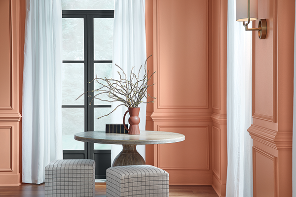
“When women look at shades of pink, they tend to become more optimistic,” Augustin says. Pinks can be interesting, because when they’re not too saturated — think baby pink instead of hot pink — they can create a relaxing environment, she says. While saturated pinks were everywhere last year (like Benjamin Moore’s Raspberry Blush 2008-30), this year, less saturated versions will be more popular, as seen in Sherwin Williams’ Persimmon by HGTV Home SW6339. As a soft coral color with a tangerine undertone, it strikes a balance between calming and energizing. For retailers looking for interior colors that are unconventional without being overwhelming, Persimmon could be a good choice. Another is Carlstadt, New Jersey-based Pantone’s color of the year, the soft Peach Fuzz 13-1023.
Light and bright
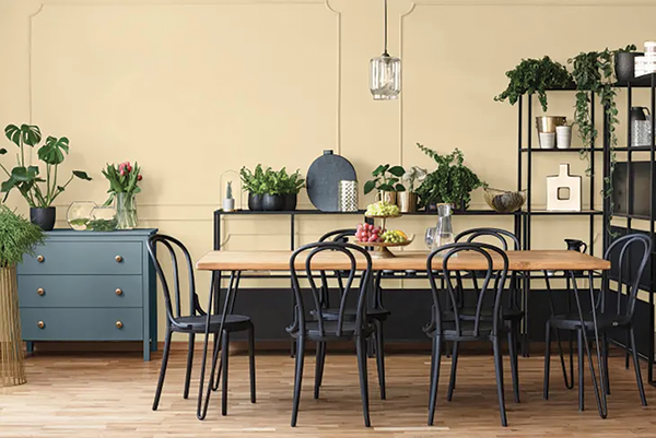
It doesn’t get more classic than a bright white. “It won’t be any surprise to learn that we associate white with cleanliness,” Augustin says. Its psychological influence makes it popular in retail settings, particularly in mattress stores. But a word of warning — only use it if you know you can keep it clean. For something livelier than plain white, consider Glidden’s pick for color of the year, Limitless PPG1091-3. Intended as a modern neutral, the honey-beige color complements warm and cool colors.
“We are entering a new era of explosive creativity and change,” says Ashley McCollum, PPG color expert for Pittsburgh-based Glidden. “Consumers are using color in even more unconventional ways than ever before, and they need a palette that offers versatility to work with both new and existing decor.”
Dark and moody
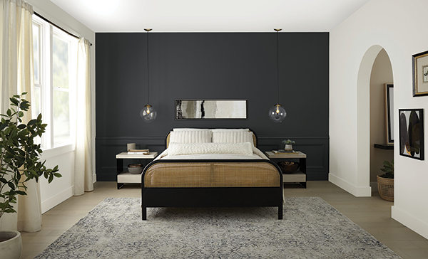
Darker shades can be intense — particularly in retail settings — but when used in the right way, they can create a powerful effect without being overwhelming. A recent survey by Santa Ana, California-based paint company Behr found that 65% of Americans say a dark color “makes a room feel bold,” while 56% say it feels stylish. It’s perhaps unsurprising then that Behr selected the soft black Cracked Pepper PPU18-01 as its 2024 color of the year. According to Augustin, black is linked to sophistication.
Although this color isn’t right for every retail setting, there are a few uses. Due to its dark shade, Augustin says it could help large spaces feel smaller and more intimate. “If you had the right shaped store, you could pull one of the walls in visually,” she says. Or, if you were in an almost unnaturally bright space, Cracked Pepper would help temper it. Another creative use would be on an accent wall to visually highlight a display.
York, Pennsylvania-based York Wallcoverings also went dark. Inspired by nature, Bay Brown is part of the company’s 2024 color trends palette, Elements. It also features colors such as the beige Mushroom, light White Chocolate, moody blue Aurora Borealis, soft green Lucky Jade and the terra cotta Baked Earth. “With the emergence of quiet luxury, we’re seeing a gravitation toward warm, understated neutrals across fashion and furnishings alike, and Bay Brown reflects a rich base color that’s incredibly versatile, yet very personal and unique,” says Carol Miller, color and trend expert for York Wallcoverings.
Go green
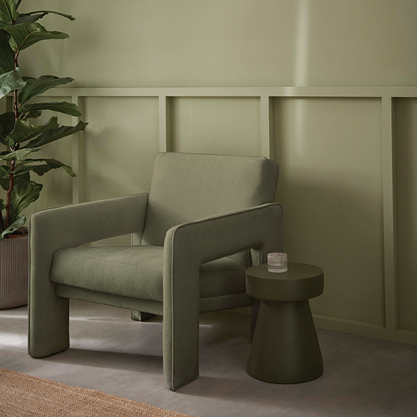
“All different sorts of greens have been shown to enhance our creative performance or creative thinking,” Augustin says. Viridis, a muted yet dramatic shade of green that nods to nature, is Graham & Brown’s 2024 color of the year. “We wanted to highlight the healing and rejuvenating qualities of nature and the need to create calm and take the time to slow down in this bustling world,” says Maryanne Cartwright, head of design for the Blackburn, England-based wallcovering company.
Cleveland-based Dutch Boy Paint went a shade darker with its deep olive Ironside 422-7DB. “For color, the green undertone of Ironside has the calming elements that we seek from natural shades — designing a space to promote positive wellness,” says Ashley Banbury, color marketing manager for Dutch Boy.
Looking ahead
Even though we’re only at the beginning of 2024, the color forecasting industry is already looking years into the future. New York-based consumer insight and trend forecasting company FS recently made its predictions for 2025 and beyond. In spring and summer 2025, color palettes will include what the company calls Enlivened Midtones, with colors like terra cotta, burnt ochre and artichoke. Also, look out for a twist on neutrals with colors like muted lemon, auburn and dark beige. In the fall of 2025, FS predicts Urgent Orange will be an anchor color, signaling that boldness will come back after years of nature-inspired shades. Although trends are cyclical, the psychology behind colors — and how they make us feel — never goes out of style.