
Behind-the-scenes of SleepOvation’s transformation into Kiwi Sleep.
Wharton, New Jersey-based sleep products company Kiwi Sleep (formerly known as SleepOvation), recently unveiled its refreshed brand identity created in partnership with Helen Thompson, founder of Helen Thompson Design, and Lis Thomas of Summary Content Marketing. Below, the duo share insights into the process and some considerations for companies when developing a branding strategy.


What inspired the new branding?
Lis Thomas: First, we wanted to highlight the company as a family brand, not just a health-focused mattress company. Second, we wanted to appeal to a younger audience, including first and second-time parents. Third, we endeavored to create a new brand that was more playful and warm while retaining the company’s core values of focusing on safety and health.
How did you decide on the name Kiwi Sleep?
LT: Because the mattress and sleep markets are highly saturated, discovering the Kiwi Sleep name was a fun challenge. When I am naming a company, I start with a process of elimination around words and phrases that represent the ethos and core values of the brand. I then spent time searching for existing organizations in the same space to avoid copyright issues.
While conducting research for Kiwi Sleep, I discovered that several fruits and animals are associated with sleep. Because the company is a full-family brand with mattresses for babies and adults, we chose “kiwi” because the color palette would be bright and playful, and the word itself is fun, crisp and warm.
Why is color crucial in branding?
Helen Thompson: Color is a super important part of the brand design process because it is one of the first parts of your visual presence that consumers see and understand. When creating a brand’s color palette, I carefully consider the meanings and subconscious associations of each color and the balance between the hues. For Kiwi Sleep, we wanted the palette to evoke the tranquility of sleep but not blend into the sea of blues in the mattress industry.
How can a company convey its identity to consumers while remaining authentic?
HT: Understanding your brand’s core values is important to consider when going through the branding process. When I work with my branding clients, we identify some brand keywords that we can use as guides to ensure we are staying true to the brand’s ethos. Some of these keywords included safety, trust, quality and playfulness. When designing, I referenced these ideas and made decisions around color, type, and graphics.
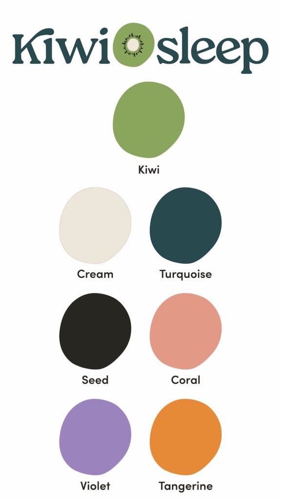
Color Play
Primary Colors


“The accents bring that sense of playfulness while contrasting nicely with the calming turquoise and neutral cream tones,”
Helen Thompson
Accent Colors


Read more on color trends, Calming Color Trends: Exploring the Psychology of Hues in Design.